
June 30, 2020
As promised we have a new view to share today!
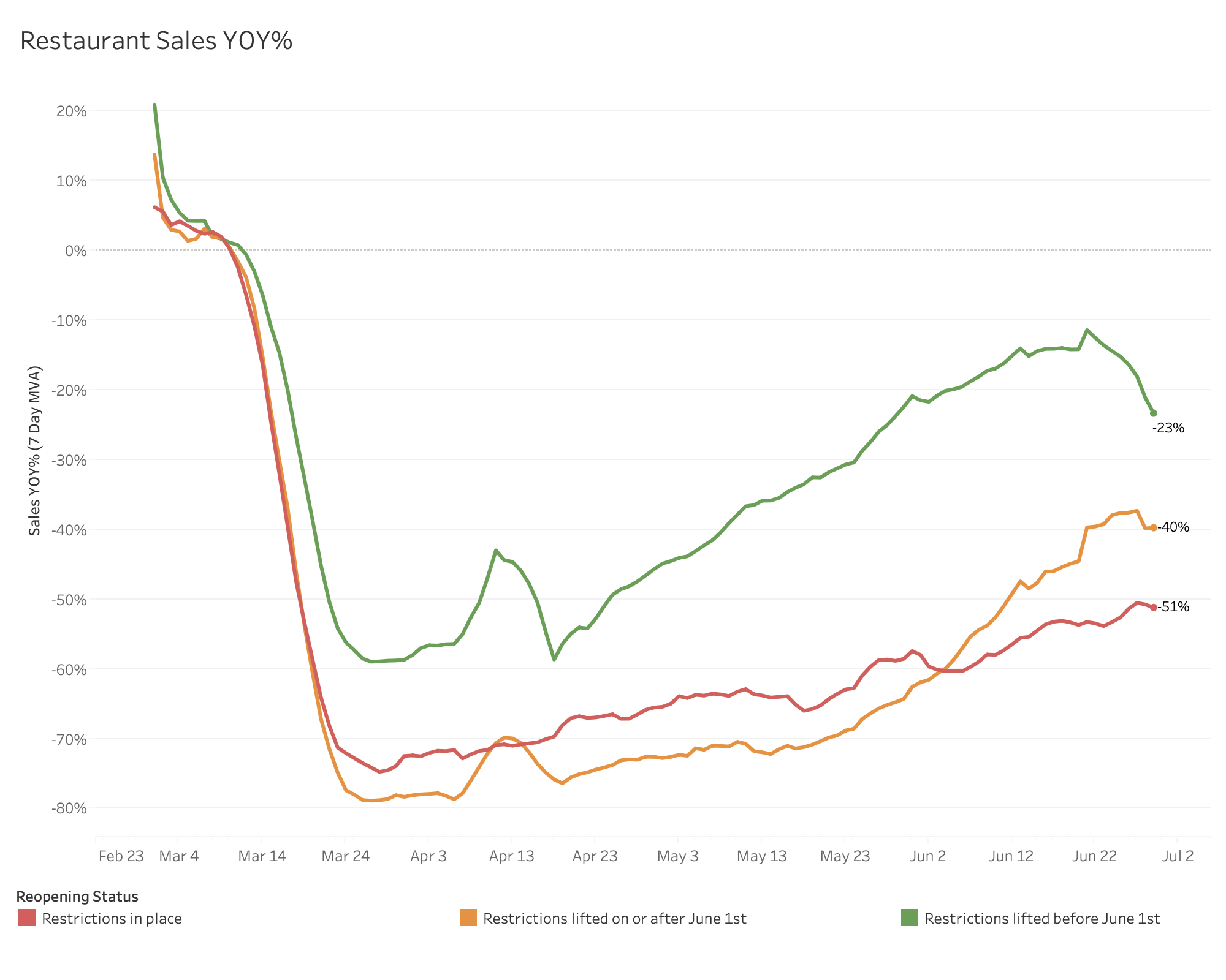
We’ve been tracking year-over-year sales by reopening status and we thought it only made sense to start watching closures through the same lens.
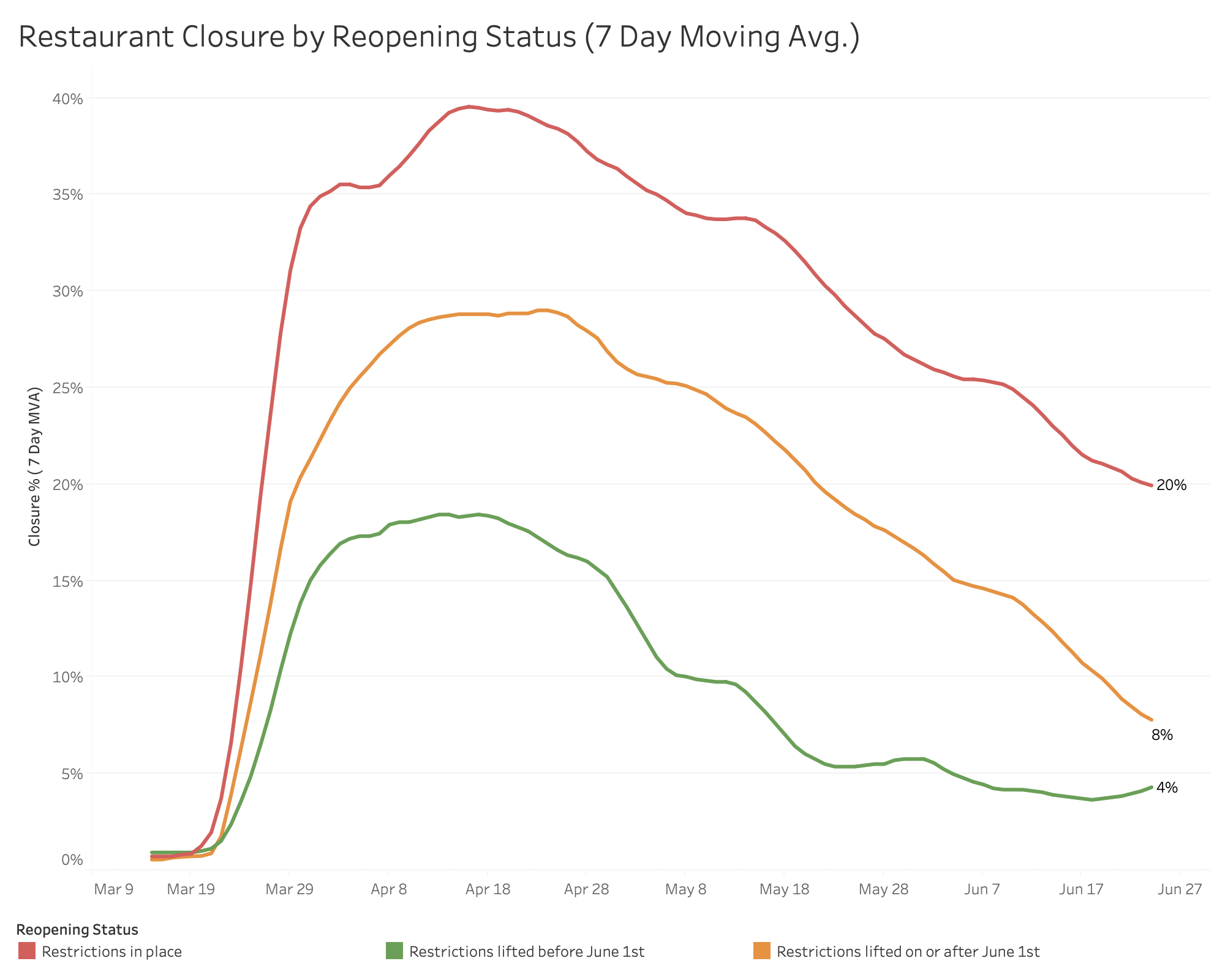
You can see that for our earliest markets to enter Phase 2 (green line) hit their peak around 18% and took a 14% drop over the following 6 weeks. Our newer group to Phase 2 (orange line) took a sharper dive going from 28% closures to 8% with two fewer weeks in Phase 2. Hopefully we see that same quick 20% drop in closures when our markets that are still restricted (red line) hit Phase 2.
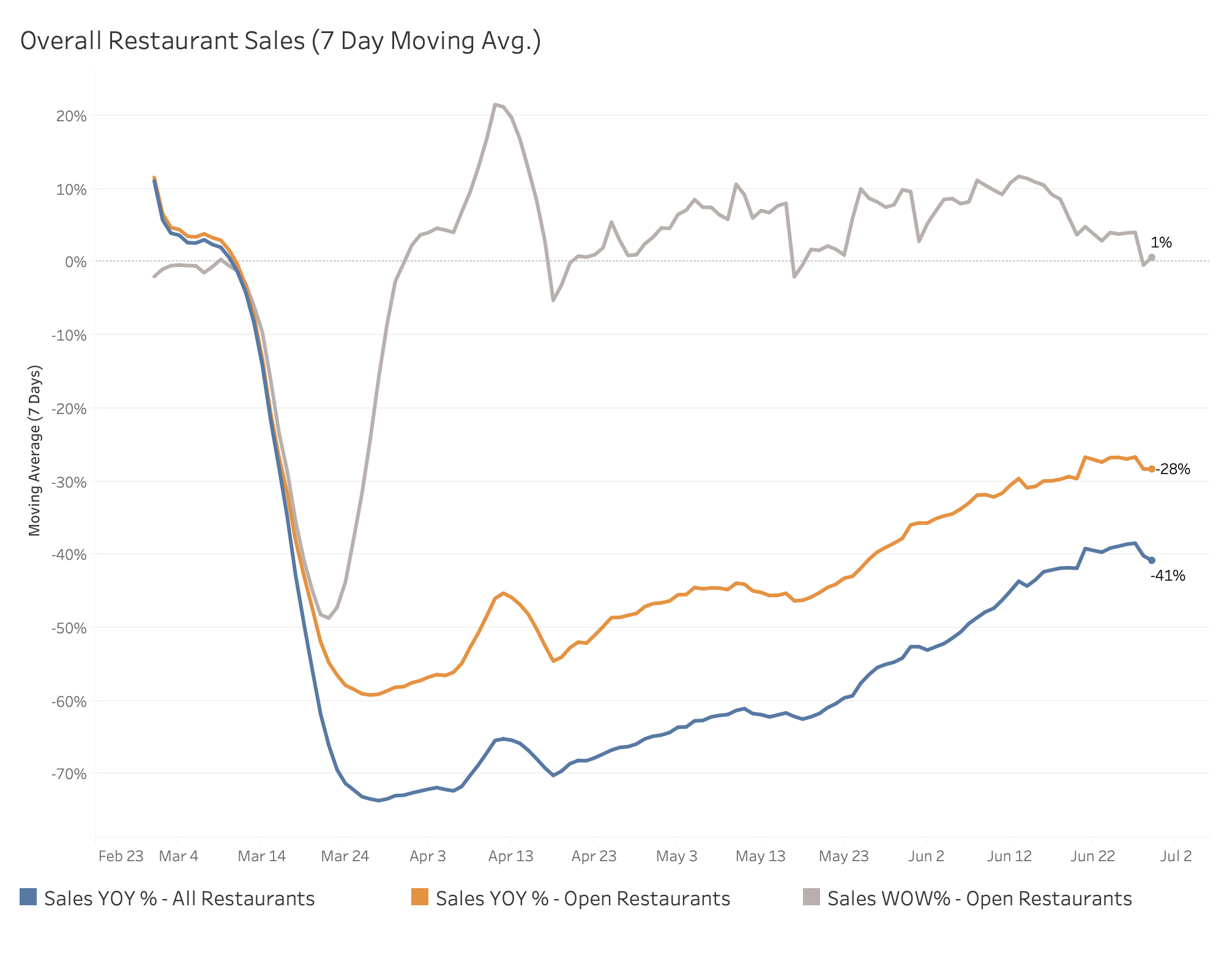
Have to believe the drop in year-over-year sales in reopened markets without a dramatic increase in closures is the impact of the reinstated restrictions on dine-in. Hopefully take-out and delivery can act as a stop gap and as soon as the dining room doors open again we will see a nice rebound back to where we were!
As always you can see the full breakdown below!
Stay safe,
Bo
PS – For those following along on these notes, but are not a MarginEdge client, we would love to include your numbers in our data set and continue to build out the value of the reporting. We are giving our MarginEdge Lite product for free for the rest of the year for new clients (normally $15/month). This little tool connects your POS to accounting system and creates journal entries – hopefully time saving for you while increasing our sample size as we track recovery across our network. Obviously no obligation or commitment, just an offer for those interested
Email Updates
Sign up to receive our emails for sales data, updates and resources as our community navigates Covid-19.
SIGN UP
Tag(s):
Metrics